Exploring Population Landscapes: 3D Maps of Egypt and Germany
Tools used: R, Adobe IllustratorThe initial spark for this project came about from my love of visualization, especially maps, which led me to discover Rayshader 3D maps. Their ability to distinctly showcase population distribution immediately caught my attention. Determined to delve into this technique, I aimed to create 3D visualizations that would straightforwardly present population densities within Egypt and Germany, both of which are important to me on a personal level.
The result was a set of high-resolution 3D maps that invite exploration and offer a novel way to visually appreciate population distribution in these two countries. The project was highly rewarding, and I learned a lot using geospatial data and working with raster formats. First, we’ll take a detailed look at the Egyptian landscape, revealing the historical interplay of its people with the environment through my 3D rendering. Following that, I’ll share an insider’s view of the coding journey that transformed raw numbers into the peaks and valleys. Finally, we’ll voyage to Germany, applying the same methods to illustrate how population is sparsely spread or densely concentrated across both rural and urban landscapes.
Nile Reigns King
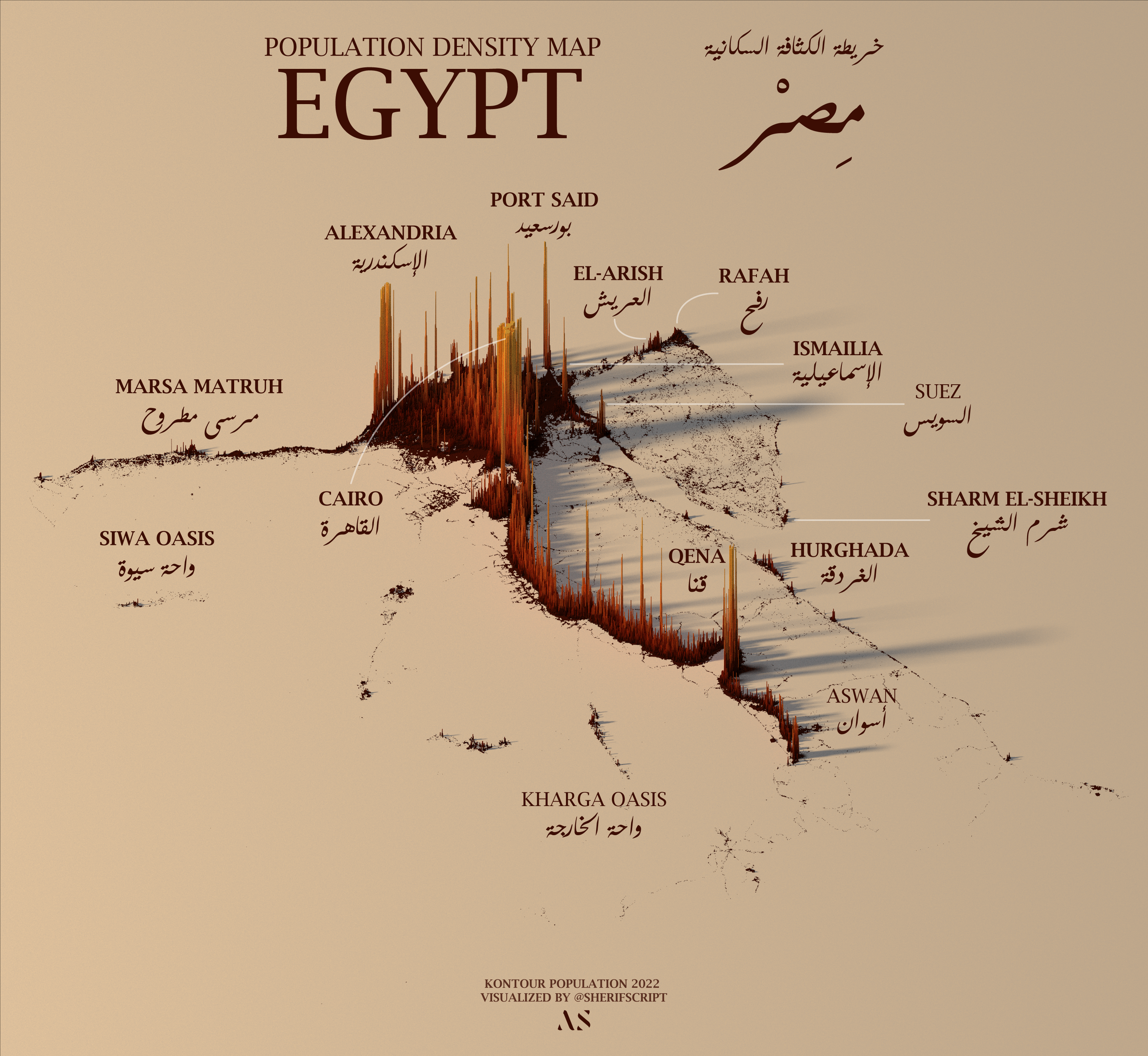
3D Population Density Map of Egypt in 2022 using the Rayshader package in R.
As the capital city and the largest city in Egypt, Cairo’s dense population is distinctly represented by a tall and concentrated spike in the map. The Nile Delta region, especially areas around cities like Alexandria and Port Said, show significant population density. The visualization distinctly highlights the historic concentration of the Egyptian state along the Nile River, a lifeline for the nation, with most of its population residing along its banks.
Other notable spikes are observed in coastal areas like Marsa Matruh and Hurghada, which are popular cities and tourist destinations. Locations such as Siwa Oasis and Kharga Oasis, although smaller, are distinct and historical; a fun fact about Siwa is that Alexander the Great was crowned Pharaoh of Egypt there in the Temple of the Oracle. These oases have historically been vital habitats in the desert landscape. The final map uses a muted beige color as the base, reminiscent of Egypt’s vast desert landscapes, as well as the Riq’ah script to reflect the most commonly used script in everyday Egyptian life.
Behind the Scenes
Initiating the project, I began by loading essential R libraries along with the Kontur Population 2022 dataset. This dataset estimates the worldwide population in 400m hexagonal geometries using a combination of GHSL, Facebook, Microsoft Buildings, Copernicus Global Land Service Land Cover, Land Information New Zealand, and OpenStreetMap data.
A significant aspect of this process was the introduction of the stars package. This was my first time using it, and it proved instrumental for its capability to handle both raster and vector datacubes effectively. The package facilitated the transformation of geospatial data, specifically in .gpkg format (imported using the sf package), into a raster format. This conversion was a crucial step, forming the backbone of the subsequent 3D rendering.
# Load Required Libraries
library(sf) #handling spatial data
library(stars)
library(tidyverse)
library(rayshader)
library(MetBrewer)
library(colorspace)

# Load Kontur Data
data <- st_read("kontur_population_EG_20220630.gpkg")

# Data Conversion: Spatial Data to Matrix
size = 5000
rast <- st_rasterize(data, nx=floor(size*w_ratio),
                     ny=floor(size*h_ratio))
mat <- matrix(data=rast$population, nrow =floor(size*w_ratio),
              ncol =floor(size*h_ratio))
With the data prepared, Rayshader takes the stage, turning our matrix into a 3D plot using the plot_3d() function from the rayshader package. The following snippet of code illustrates how the matrix was transformed into a digital elevation model, which then served as the canvas for our 3D plot. Parameters such as zscale, solid, and shadowdepth determine the visual characteristics of the plot, such as the elevation scaling and shadow effects. Camera angles were adjusted by render_camera() to provide the best view.
# Create 3D Plot using Rayshader
mat |> height_shade(texture = texture) |>
plot_3d(heightmap = mat, zscale = 200/5, solid = F,
        shadowdepth = 0)

# Adjust Camera Angles
render_camera(theta = -20, phi = 45, zoom = 0.8)
The final image below showcases the result of these processes. I used the render_highquality() function from the rayshader package to output a detailed representation of Egypt’s population density. The heart of the aesthetics is the dynamic double-shadow effect achieved by using two distinct light sources. Two lightaltitude() values, 30 and 80 degrees, are defined. The first light source at a lower altitude creates sharper and longer shadows, emphasizing the population spikes, while the higher altitude light creates softer shadows, adding depth to the visualization. With lightintensity() parameters of 600 and 100 respectively, the primary light source is much brighter, creating dominant shadows, while the secondary source gives a diffused lighting effect.
# Adjust camera angles and Render plot
render_camera(theta = -20, phi = 45, zoom = 0.8)
render_highquality(
    filename = outfile,
    interactive = F,
    lightdirection = 280,
    lightaltitude = c(30, 80),
    lightcolor = c(c1[4], 'white'),
    lightintensity = c(600, 100),
    samples = 450,
    width = 6000,
    height = 6000
)
Final Output
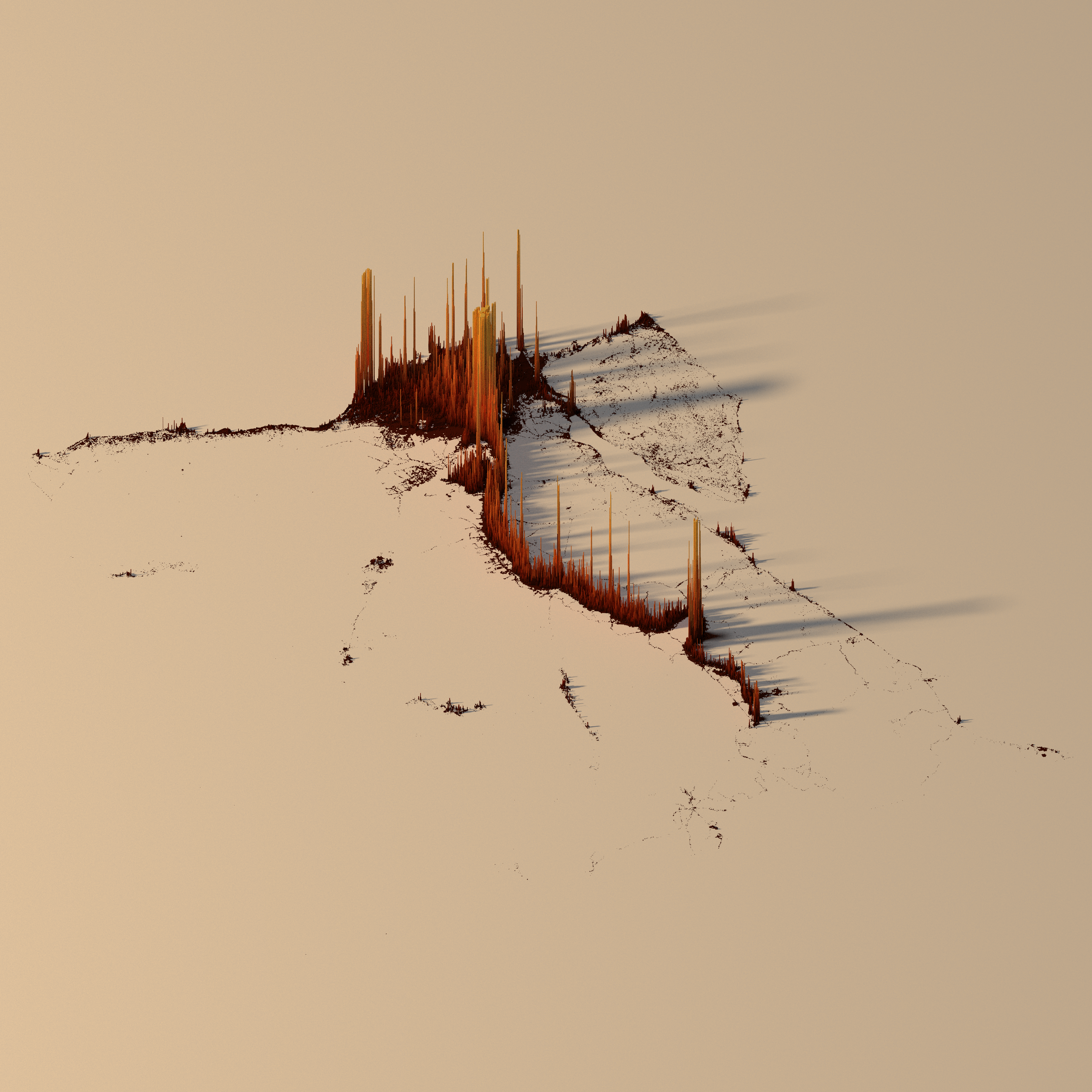
Final output of R project, before adding labels with Adobe Illustrator.
I chose the color palette provided by MetBrewer due to my love of renaissance art and the package’s ability to encapsulate all sorts of palettes from different artistic movements. For Egypt, the “Greek” palette presented a beautiful choice to reflect Egypt’s vast beige deserts and intense density reds. The colors were further enhanced by colorRampPalette to give it more depth. The colors not only make the visualization appealing but also help in distinguishing population density variations.
# Generate Color Palette using MetBrewer
c1 <- met.brewer('Greek')
texture <- grDevices::colorRampPalette(c1, bias=2)(256)
A look at Germany
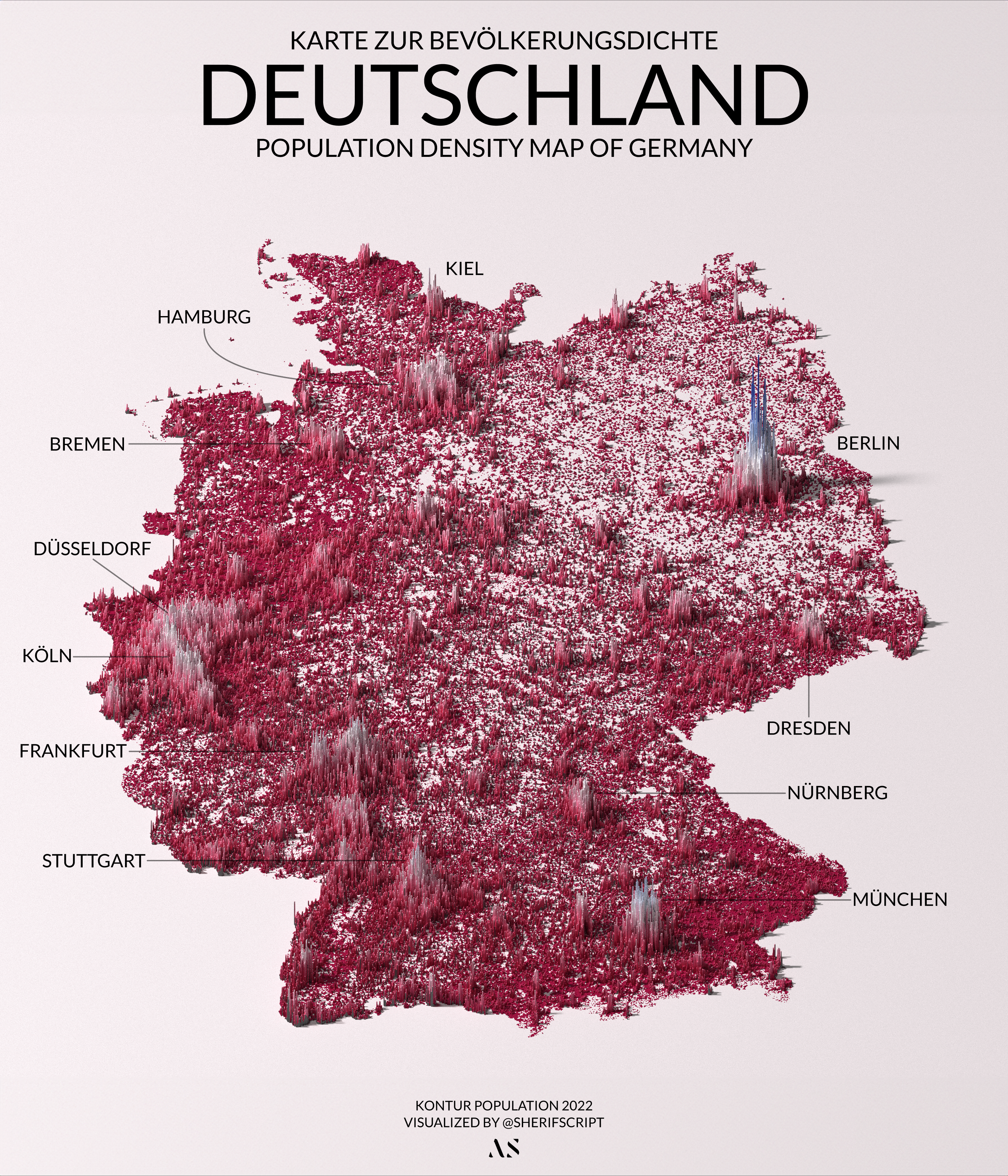
Population Density Map of Germany in 2022.
Transitioning from the Nile-focused population of Egypt to Germany’s diverse distribution, the same 3D mapping techniques take on a different journey. This map illustrates the contrast between Germany’s bustling urban centers and its serene rural areas. The stark spikes of Berlin, Munich, and Hamburg rise prominently, each peak representing the dense hubs of activity and culture these cities are known for. Less densely populated areas, like those surrounding Dresden and Nuremberg, create a textured landscape of valleys amidst the high urban peaks.
Taking a closer look at the map, you can’t help but notice an empty semi-circle region of lands surrounding Berlin. At first glance, it might seem like a whimsical dip in the data or a playful stamp of sorts. In reality, this area is known for its sparse population, a phenomenon that is not rooted in a single cause but rather a tapestry of theories. Some suggest that Berlin’s marshy foundations, shaped by its glacial history, have influenced settlement patterns (Berlin’s name allegedly derives from the Slavic word berl, meaning ‘swamp’). Others point to the transformation of the landscape by human intervention and industrialization, attracting migration from that area towards Berlin. It is most likely a result of the region’s layers of history and geography as a whole rather for a single definitive reason.
In this project, I tried to bring together data analysis, geospatial analysis, and graphic design. One of the standout features is the meticulous care taken in aspect ratio handling and color palette generation, ensuring the final 3D plot is not only accurate but also visually compelling. Another interesting aspect is the seamless integration of spatial functions with 3D rendering capabilities, showcasing the power of R in handling diverse tasks. The full project can be found on GitHub along with other graphics and the Adobe Illustrator file.